
WearWorks
Summer Design Internship 2019
User Journey Prototyping
Adobe Photoshop, Illustrator and Indesign
WearWorks is a haptics design company based in New York City that developed the Wayband, a vibration-based navigation device for the blind.
As a summer design intern from May to August 2019, my objective was to redesign the company website to be more accessible and to more effectively communicate the features of the Wayband and the company's goals.
Check out their website here
Design Problems
-
The product’s function was not evident due to technical jargon and lack of clear explanation
-
The user experience with the device was vaguely described
-
Information and mission statements were repeated or inconsistent across pages
-
Images did not have descriptive alt text, layout and navigation was different on every page
-
Text needed to be more concise and effective


I analyzed the existing website for accessibility and communication issues, comparisons to competitors like Eone and Two Blind Brothers, and layout problems. Some of the problems identified were:
How I Approached the Problems
I developed several iterations of the website, constantly brainstorming whiteboard mockups and user flows. Here are some of the final outcomes after 2 months and several versions of the website.
Product Functionality and Experience
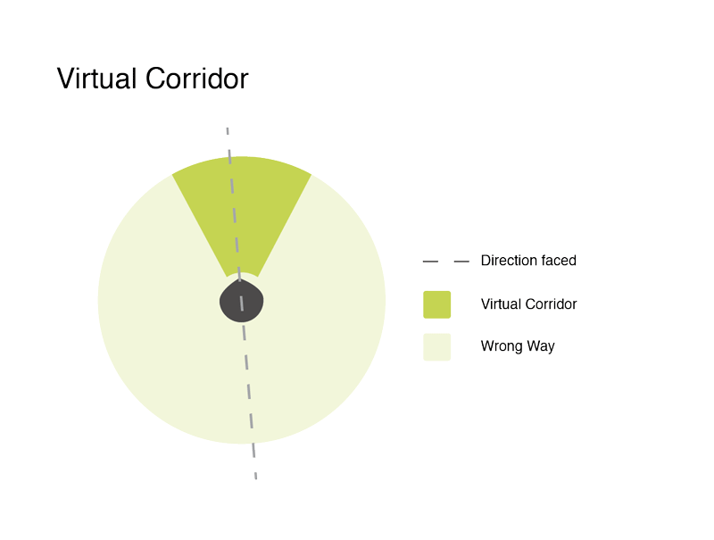
I created graphics to better communicate the device's functionality and the user experience. These were used for the website or social media.
Connecting the App and the Device
I added a section explaining the link between the device and the app, since that was never mentioned earlier. Using a screen capture of the app being used showed how to pair the device, enter a destination and begin the journey.
The awards were added right under the device to emphasize the startup's credibility.


Layout and Navigation
To improve navigation, I reduced the number of pages by making the homepage the product (Wayband) page, since the company was essentially the product at that stage. I also began each page with a banner image and preview of the content of the page, to make the layout more consistent.
Communication Aids
To explain the vibration mechanism I extracted the simulation gif from a video made by Discovery for the company. Below that, I added a short video by a famous blind runner explaining how the device works in his own words, to make the technology feel more human and understandable.


Responsive Design
To ensure a responsive and clean mobile layout, different sections of information were placed in different layout strips when designing it on Squarespace, so that entire sections could be scaled together automatically.
Concise Copy
I wrote different versions of the product's description and the team's mission statements, combining previously inconsistent ones. Working alongside a consulting copywriter was very helpful.
I directed most of the statements directly at the users, to emphasize their experience with the product.

What I Learnt
-
Companies often produce a lot of usable graphic and marketing content (images, videos, etc.) which needs to be organized, edited and curated to be useful for advertising and communication purposes.
-
Startup founders' conversations and talks can be very helpful for brainstorming website copy.
-
It is difficult to make websites fully accessible if using template website platforms because layout, color schemes and contrast are restricted. Alt text can only accomplish so much.
-
Designing a website is a continuous, iterative process. Thus, having a flexible and modular design is helpful for making future changes.